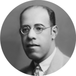
 Mário de Andrade
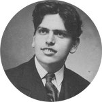 Oswald de Andrade
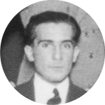 Ruben Borba de Moraes
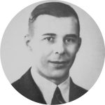 Tácito de Almeida
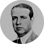 Couto de Barros
 Luís Aranha
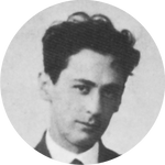 Sérgio Milliet
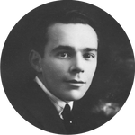 Guilherme de Almeida
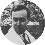 Yan de Almeida Prado
Editorial data
Klaxon magazine, launched shortly after the 1922 Semana de Arte Moderna, presented itself as a modern art monthly, had an editorial and administration office located in the city of São Paulo and was published from May 1922 to January 1923. Single issues were priced at one thousand réis and the annual subscription cost 12 thousand réis. Starting with issue 4, printing was carried out at the Tipografia Paulista, on Rua da Assembleia, 56-58, São Paulo. The magazine, which came out every month, had 16 pages, with the exception of the last instalment, a double containing issues 8 and 9, dated December 1922 and January 1923, with twice the number of pages.
The publication’s editorial information did not specify direction, management, or ownership, but the main members of the group that led the Semana de Arte Moderna appear as frequent collaborators. It stated that the editorial team was not responsible for the ideas of the magazine’s collaborators and that articles signed under pseudonyms would be allowed, as long as the editors were informed of the authorship. The periodical’s representatives were listed as follows: Sérgio Buarque de Holanda, in Rio de Janeiro; Charles Baudouin, in the inaugural issue in Geneva, Switzerland, and, from the second onward, in Paris; Albert Ciana, who replaced Baudouin in Geneva; Roger Avermaete, in Antwerp, Belgium; and Joaquim Inojosa, in Recife.
The content of the modernist magazine distinguished itself by the sarcastic and, at times, aggressive tone, which sought to assert the changes proposed by the “moderns” as a counterpoint to the production of so-called “passadistas”. Among the articles, chronicles, and poems, literary productions in Spanish, Italian, and French can also be found.
The writers and artists responsible for the texts were Guilherme de Almeida, Pedro Rodrigues de Almeida, Renato de Almeida, Mário de Andrade, Graça Aranha, Luiz Aranha, Carlos Alberto de Araujo, Roger Avermaete, A. O. Couto de Barros, Nicolas Bauduin, Manuel Bandeira, L. Charles Baudouin, Joseph Billiet, Claudius Caligaris, Ronald de Carvalho, Ribeiro Couto, Gaetano Cristaldi, Menotti del Picchia, Luiz Aníbal Falcão, António Ferro, Sérgio Buarque de Holanda, Nico Harigoutchi, Durval Marcondes, Marcel Milliet, Rubens Borba de Moraes, Motta Filho, Henry Mugnier, Vin. Ragognetti, Plínio Salgado, Guilhermo de Torre. In addition, Plínio Doyle1 stated that Mário de Andrade used the following initials: G. de N., J. H. de A., M. de A., R., R. de M., V. L. Cecília de Lara2 mentions that S. M. stands for Sérgio Milliet; A. C. B. was used by Antonio Carlos Couto de Barros; and that Tácito de Almeida used the pseudonym Carlos Alberto de Araujo. The pseudonyms Interim and May Caprice remain unidentified.
The graphic layout of the cover was by Guilherme de Almeida, albeit unsigned. The letter “A” of the magazine's logo took up the entire vertical extension of the cover, in order to provide the “a” of various words in the title, subtitle, and place of publication. In addition, the issue number found in the footer was presented with the baseline turned to the left, that is, rotated 90 degrees. The cover, printed in two alternating colours, used black to highlight the enormous letter A and the issue number.
The inside of the publication was printed entirely in black and used the upper and lower margins to highlight, with the use of boldface and a larger font size, the page number, placed in the upper centre, and the magazine’s name, with wide spacing between letters to occupy the entirety of the live area in the footers. Literary content, like poems, was laid out in a left-aligned text column. Articles and chronicles, on the other hand, were arranged in two columns, with a divider between the blocks of justified text. Titles were commonly highlighted by using larger and bolder fonts, but patterns varied.
The images were printed in black, on separate sheets, and were bound into the magazine's interior. The authors of the illustrations were Di Cavalcanti, Victor de Brecheret, Yan de Almeida Prado, Zina Aita, Annita Malfatti, John Graz, and Tarsila do Amaral.
Only two ads, designed by Guilherme de Almeida, appeared in the first two issues. The first, by Chocolates Lacta, featured the words “coma” and “Lacta” repeatedly in an asymmetrical composition, and the second, by Guaraná Espumante, showed a character with a long beard overlaid by stripes with the names of different drinks crossed out and only the “sparkling guarana” left untouched. These two advertising inserts were unique, and the magazine published a note in issue 4 to say that it would no longer recommend the two products until the companies started advertising again. In addition to these, Klaxon publicized the launch of works by collaborators in greatly highlighted typographic ads with the use of larger and different fonts, placed on both sides of the back cover. In addition, two advertisements for fictional companies called “Panuosopho, Pateromnium & Cia” and “Pantosopho, Pateromnium & Cia” were published. They were described as an “international factory of sonnets, madrigals, ballads, and quatrains”, complete with product prices, and readers were informed of a chemical-grammatical analysis laboratory, which supposedly had been set up in São Paulo to serve the vast interested public.
Letícia Pedruzzi Fonseca


